LOCALIZACIÓN
CONTACTO
SUSCRÍBETE
AGENDA
Saltar al contenido
EN
ES
Proyectos
Catálogos
Prensa
Contacto
Proyectos
Catálogos
Prensa
Contacto
Facebook-f
Instagram
Visita
Información General
Prepara tu visita
Exposiciones
Temporales
Colección Permanente
Próximas
Histórico
La Colección Ralli
Artistas (A-Z)
Recorridos temáticos
Obras destacadas
Educación
Centros escolares
Materiales educativos
Talleres de arte
Talleres para adultos
Talleres en familia
Talleres para niños/as
Arte e inclusión
Eventos culturales Marbella, Málaga
Conferencias y podcast
El Museo
Nuestra visión
Nuestra historia
Los fundadores
Museo Ralli Marbella y su entorno
Agenda
Proyectos
Catálogos
Prensa
Contacto
Visita
Información General
Prepara tu visita
Exposiciones
Temporales
Colección Permanente
Próximas
Histórico
Colección Ralli
Artistas (A-Z)
Recorridos temáticos
Obras destacadas
Educación
Centros escolares
Materiales educativos
Talleres de arte Marbella, Málaga
Talleres de arte para adultos Marbella, Málaga
Talleres en familia
Talleres para niños/as
Arte e inclusión
Eventos culturales
Conferencias y podcast
El museo
Nuestra visión
Nuestra historia
Los fundadores
Museo Ralli Marbella y su entorno
Agenda
Abierto a partir del 3 de febrero de martes a viernes de 10h a 17h y sábado de 10h a 15h
ENTRADA GRATUITA
Exposiciones
Home
/
Exposiciones
/
Página 2
Exposiciones temporales
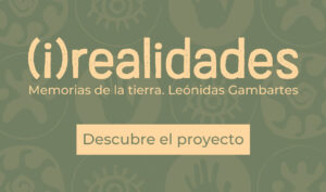
Memorias de la tierra. Leónidas Gambartes
Descubre más
Destino Argentina. Borges y Chale, mujeres artistas en la vanguardia
Descubre más
Exposiciones Colección Permanente
Arte contemporáneo en Oaxaca.
Vanguardia, mito y tradición
Descubre más
Surrealismos.
De Giorgio de Chirico a Francis Bacon
Descubre más
Arte figurativo en la América Latina contemporánea
Descubre más
Surrealismos en América Latina
Descubre más
Obra gráfica en América Latina
Descubre más
Esculturas de Mario Aguirre y Gerardo Quiroz
Descubre más
Próximas exposiciones
Histórico
Abstracción Americana · Carlos Mérida
Exposición temporal
SEOANE. Retratos
(2019-2022)
Exposición temporal
Movimiento Espartaco
(2018 - 2020)
Exposición temporal
Matta. Entre Mundos
(2017 - 2019)
AGENDA DE ACTIVIDADES
11 abril / Taller de teatro
11
de
Abril
2026
Horario:
11:00
a
13:30
Visita
Museo para Grupos
<p>Te podría interesar</p> /* widget: Lista Posts */ #uc_post_list_entries_elementor32588 .uc_post_list_image div {...
CONTENIDO RELACIONADO
Obras Destacadas
«La Familia Informal»
Descubre más
«Monstre spatial avec des mutants»
Descubre más
«La creación del mundo según el mito Mapuche»
Descubre más
«Mujer con alacranes»
Descubre más
×
Exposiciones
Temporales
Colección permanente
Próximas
Histórico
Visita
Información general
Prepara tu visita
Agenda
EDUCACIÓN
Centros escolares
Materiales educativos
Talleres
Arte e inclusión
Eventos culturales
Conferencias y podcast
La colección Ralli
Artistas (A-Z)
Obras destacadas
CATÁLOGOS
PROYECTOS
El museo
Nuestra visión
Nuestra historia
Los fundadores
Museo Ralli Marbella y su entorno
Contacto
Prensa